Case Study: Game of Pods
Art Direction • Illustration Branding • Logo Design • Icon Design • Animation • Asset Library Management • Game Development
The What
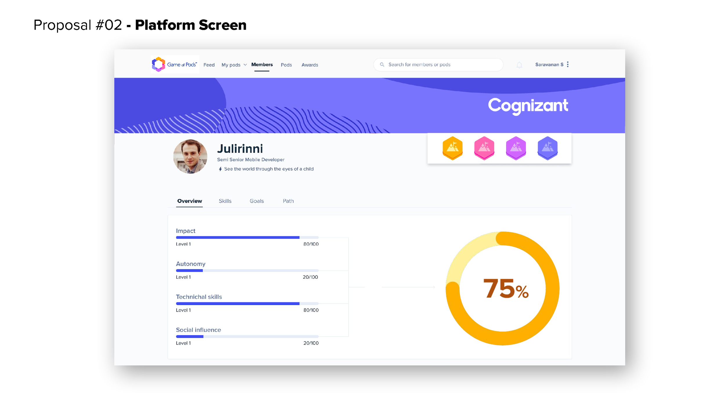
Game of Pods is a platform for measuring KPIs and employee growth within Cognizant Softvision, focusing on their “Pod” model for team-makeups. Previous branding for the product existed, however the platform would require a complete re-skin for better marketability and connections to the gamification.
The Why
Part of the impetus for change arose from copyright fears. Using an obvious homage to the popular TV and book series Game of Thrones, the original medieval branding further fueled copyright insecurities. To create distance, I was tasked with designing a fun and futuristic appeal for the Game of Pods brand.
The Outcome
The result was a robust, fun, and modern design system centered not only around the platform, but also its marketing campaigns and game mechanics. This gave the Game of Pods marketing and product teams more flexibility and confidence to design without fear of copyright infringement with a unique and distinctive brand.
“Let’s move away from the medieval branding for copyright reasons and into a more game-like territory.”
Original Game of Pods Illustration branding.
Branding Proposals
The Ask
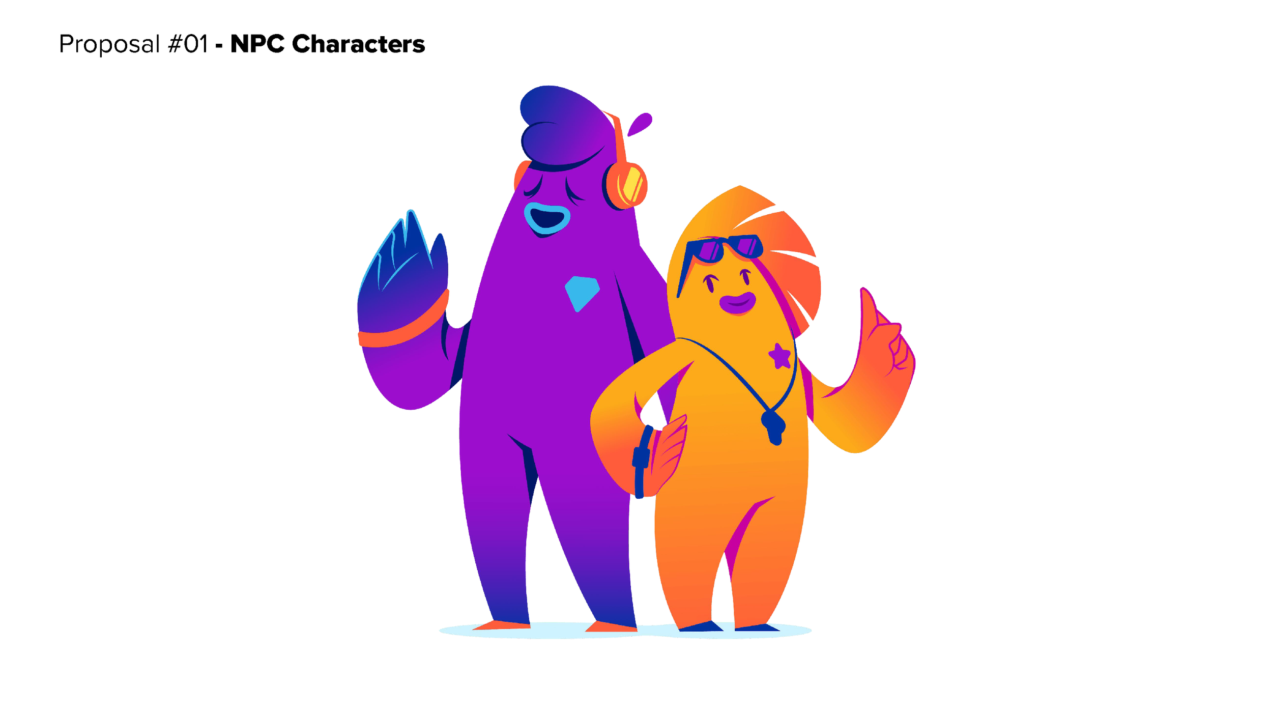
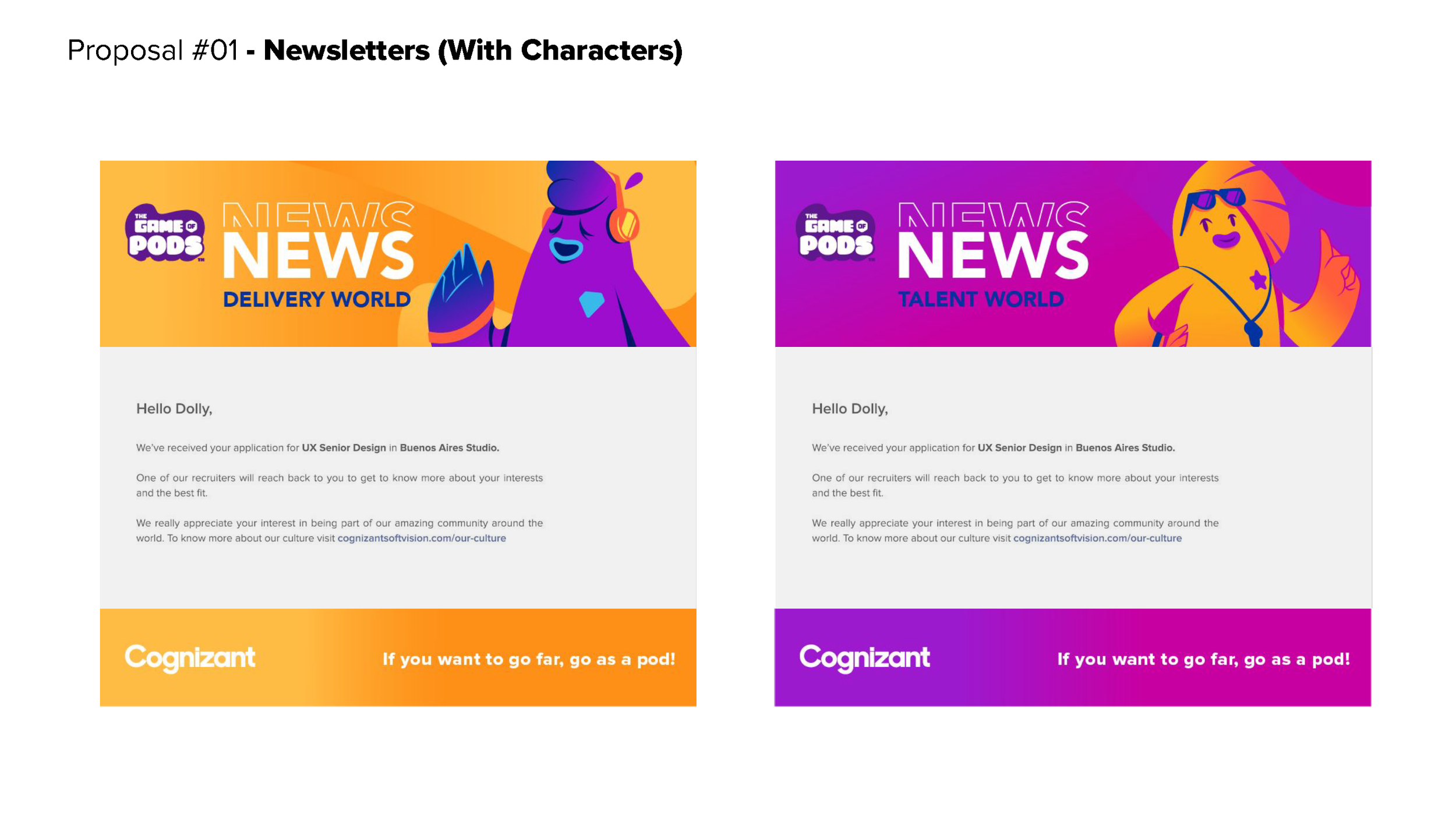
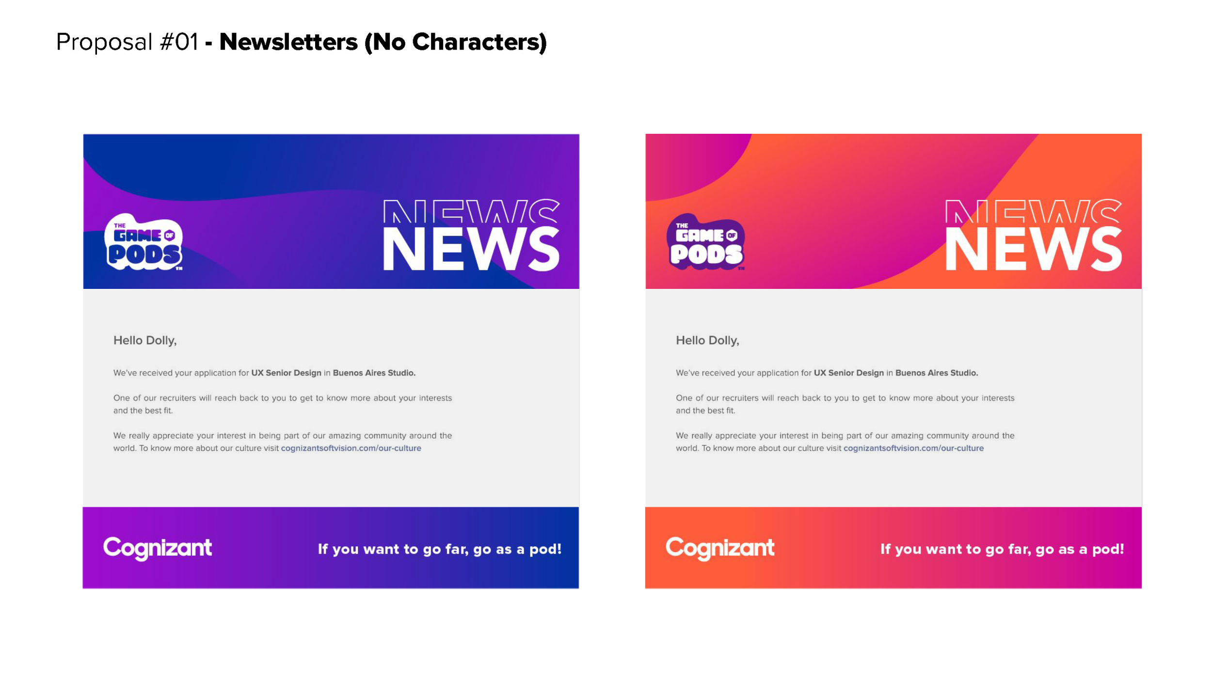
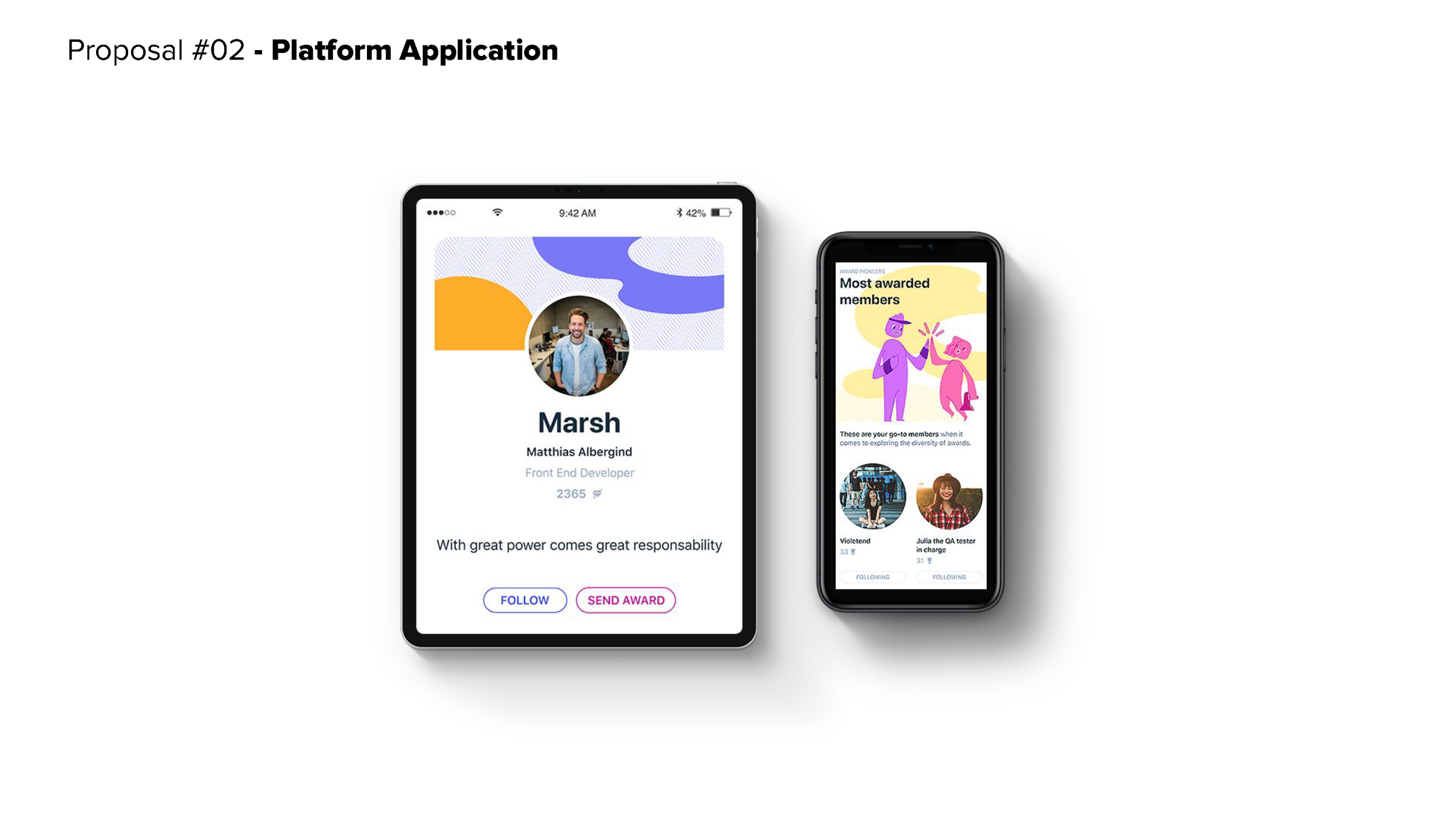
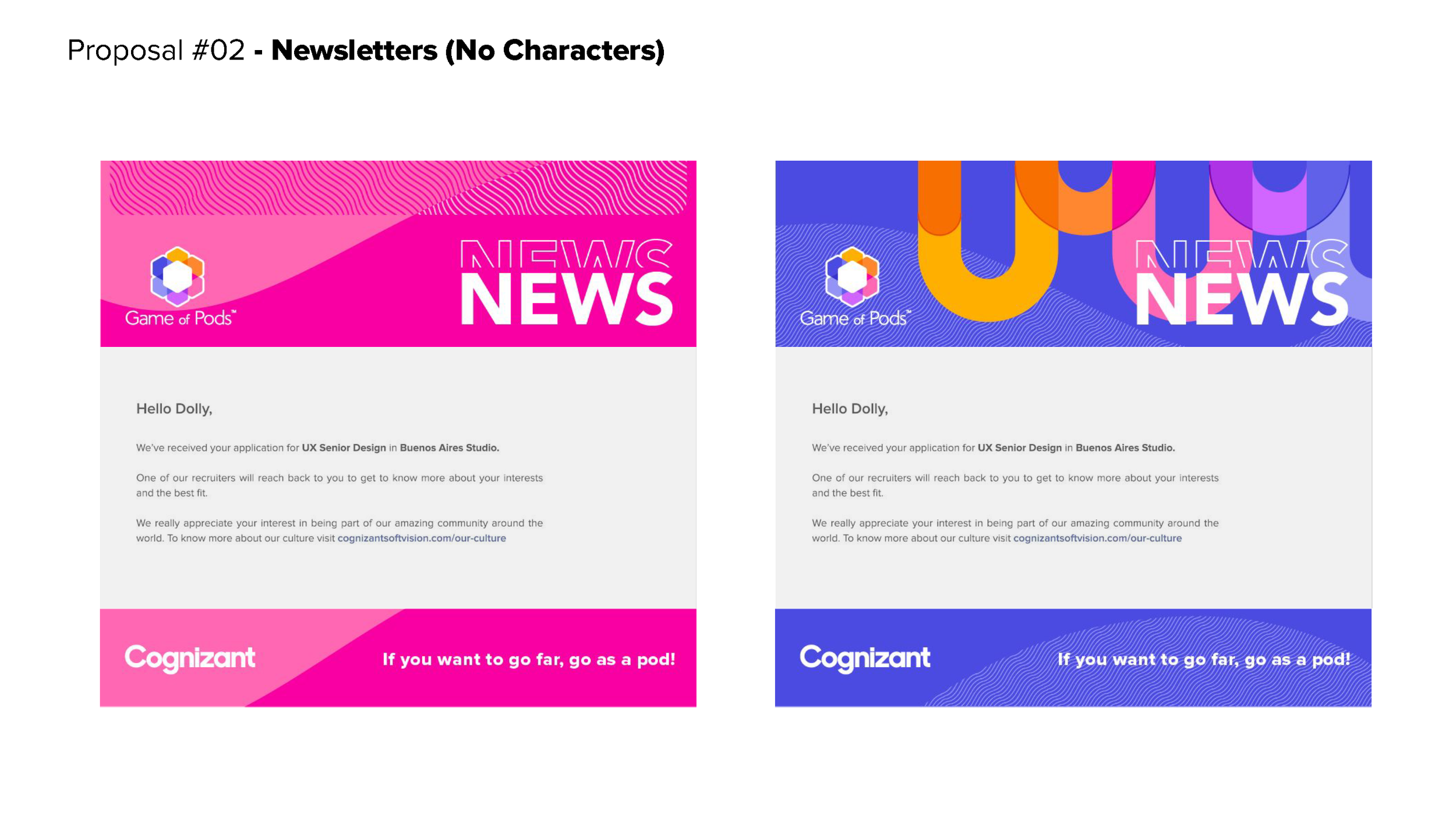
The CEO of Cognizant Softvision and the Game of Pods marketing team recruited me to create 3 branding proposals, each including a logo, gamification pieces, NPC characters, backgrounds, and marketing materials. Once completed, I would present the proposals to important stakeholders who would then choose the final direction.
My approach was to create a range of styles that varied from “Light, Fun, and Casual” to “Clean, Cool, and Corporate” using Softvisions’s “Core Blue”, ambiguous/androgynous characters, and a nod towards a spacey/futuristic vibe. The three proposals are displayed below.
“Light, Fun, and Casual”
“The Median”
“Clean, Cool, and Corporate”
Next Steps: Gamification, Brand & Site Development
After the presentation, Proposal #2 was selected for the overall aesthetic while merging the character style from Proposal #1. I proceeded by creating the many assets of Game of Pods, starting with a hero for the platform’s homepage.
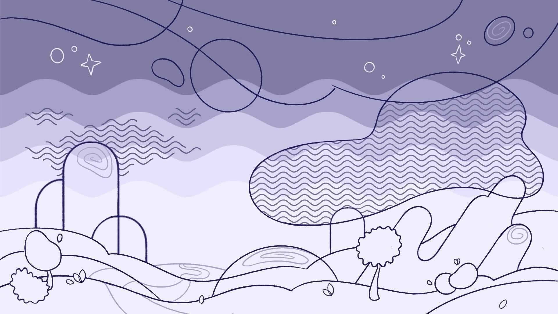
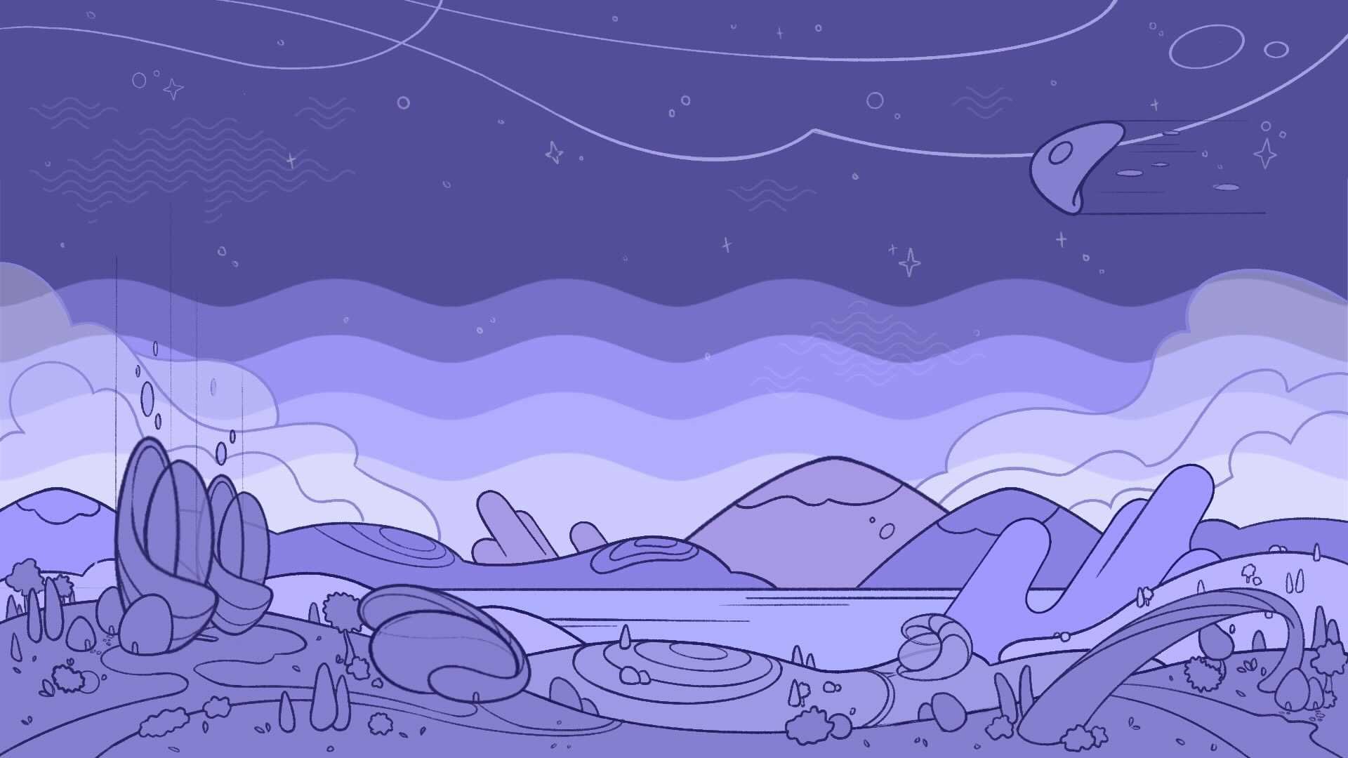
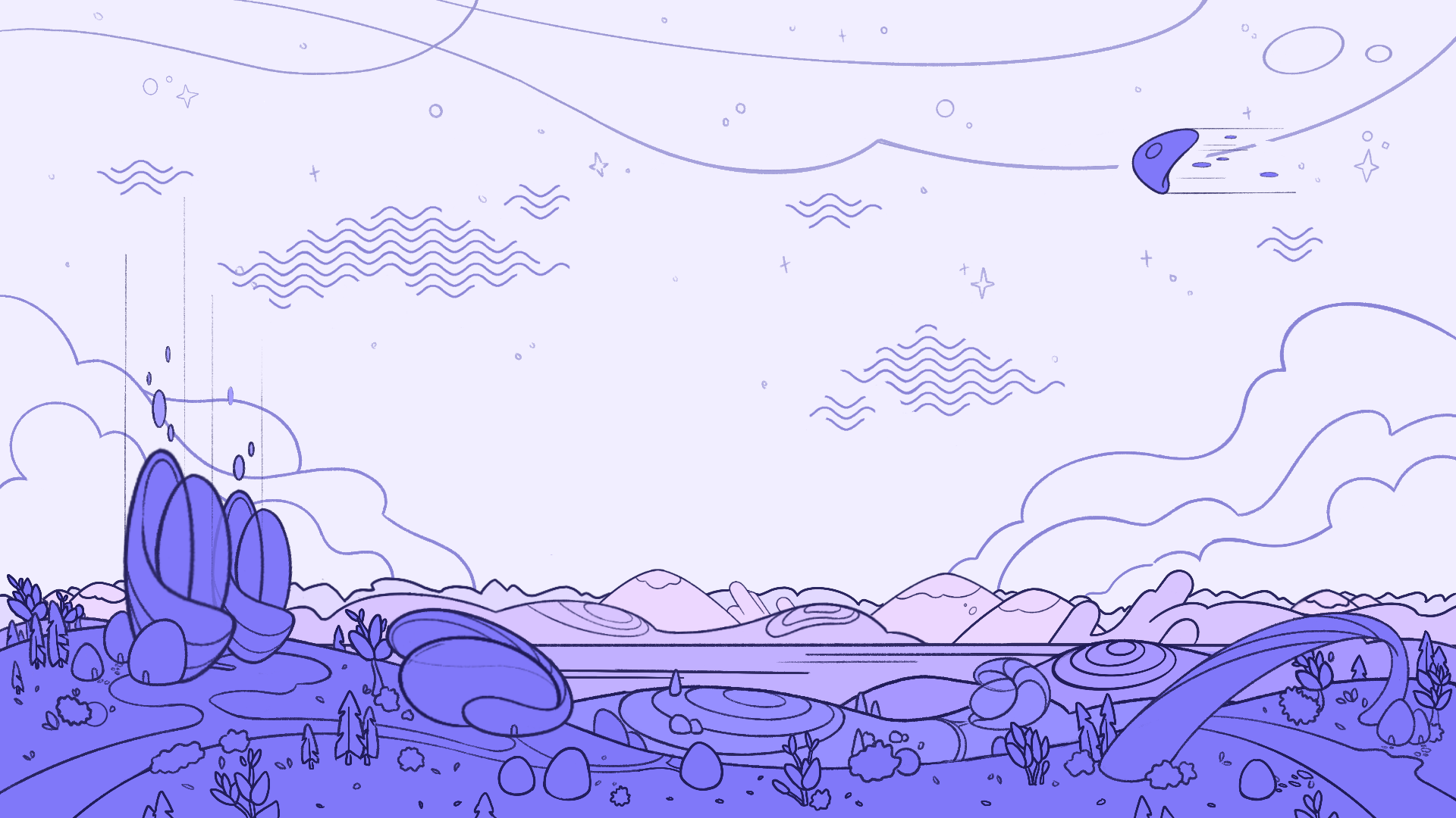
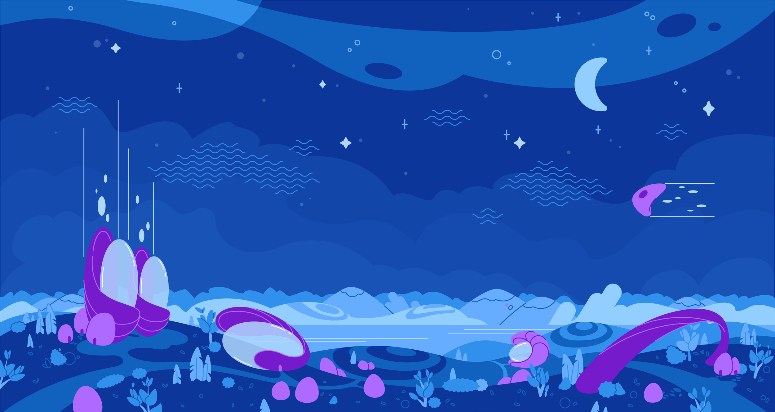
Parallax Homepage Illustration
The product team needed a homepage illustration that set the stage for the Game of Pods world with the added requirement of working with Parallax. This meant planning and developing the image in several layers to hand off to the developers for implementation. Below are a few of the sketch phases and the final illustration before implementation on the site. The final Parallax illustration can be seen here at: GameofPods.com
“Beans” Avatar Development
A key aspect of the gamification for Game of Pods was character customization for the user’s avatar. Users earn points and rewards by being engaged on the platform and achieving goals set by themselves or their clients. Users could then use those points in the shop to buy unique outfits and accessories for their avatar. This style of character was lovingly called “The Beans” and below are a few of the sketches and final assets.
Badges & Trophies
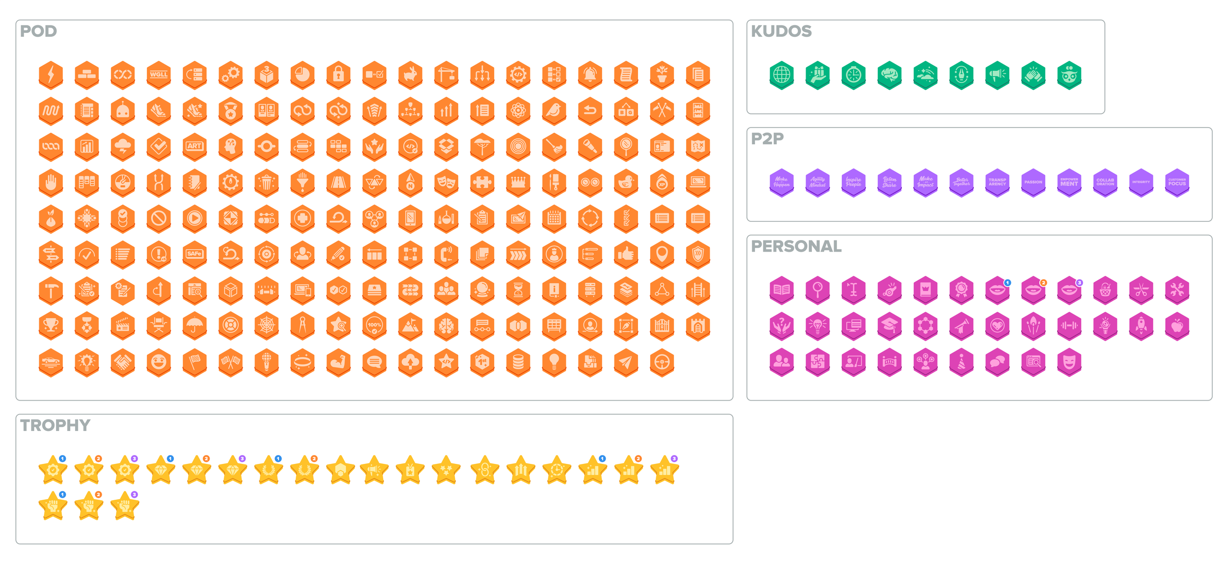
Another huge aspect of the gamification involved the creation of badges and trophies that users earn when achieving goals or quests. 5 badge types and 1 trophy style were defined for what could be earned. Each type is color-coded and in some cases shape-coded with “earn” states, status states, and unique icons for all the corresponding quests. This system can be seen below.
“Human” Illustrations
For the marketing materials it was necessary to create a set of “human” characters that could exist in the same universe as “The Beans”. They would provide a layer of familiarity for anyone new to the platform and offer up another tool for communication. Below are the sketches and final artwork for these illustrations.
NPC Character “Ebba”
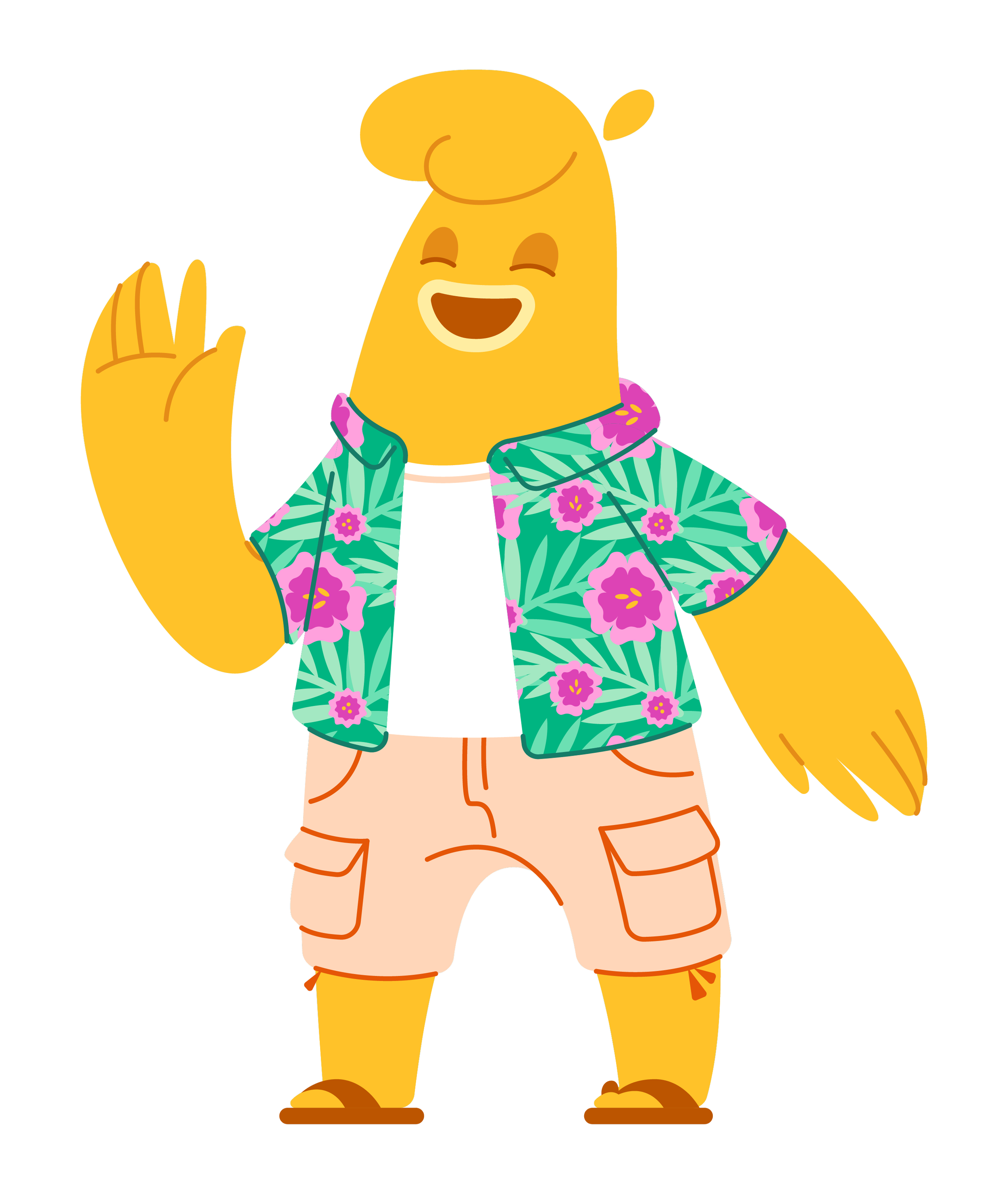
Lastly, a non-playable character or “NPC” was created for support functionality and the onboarding process on the platform. Ebba would greet users with a friendly, positive attitude and guide them through the functionality of Game of Pods. Ebba would also be available to use in promotional materials. Below are their sketches and final artwork.
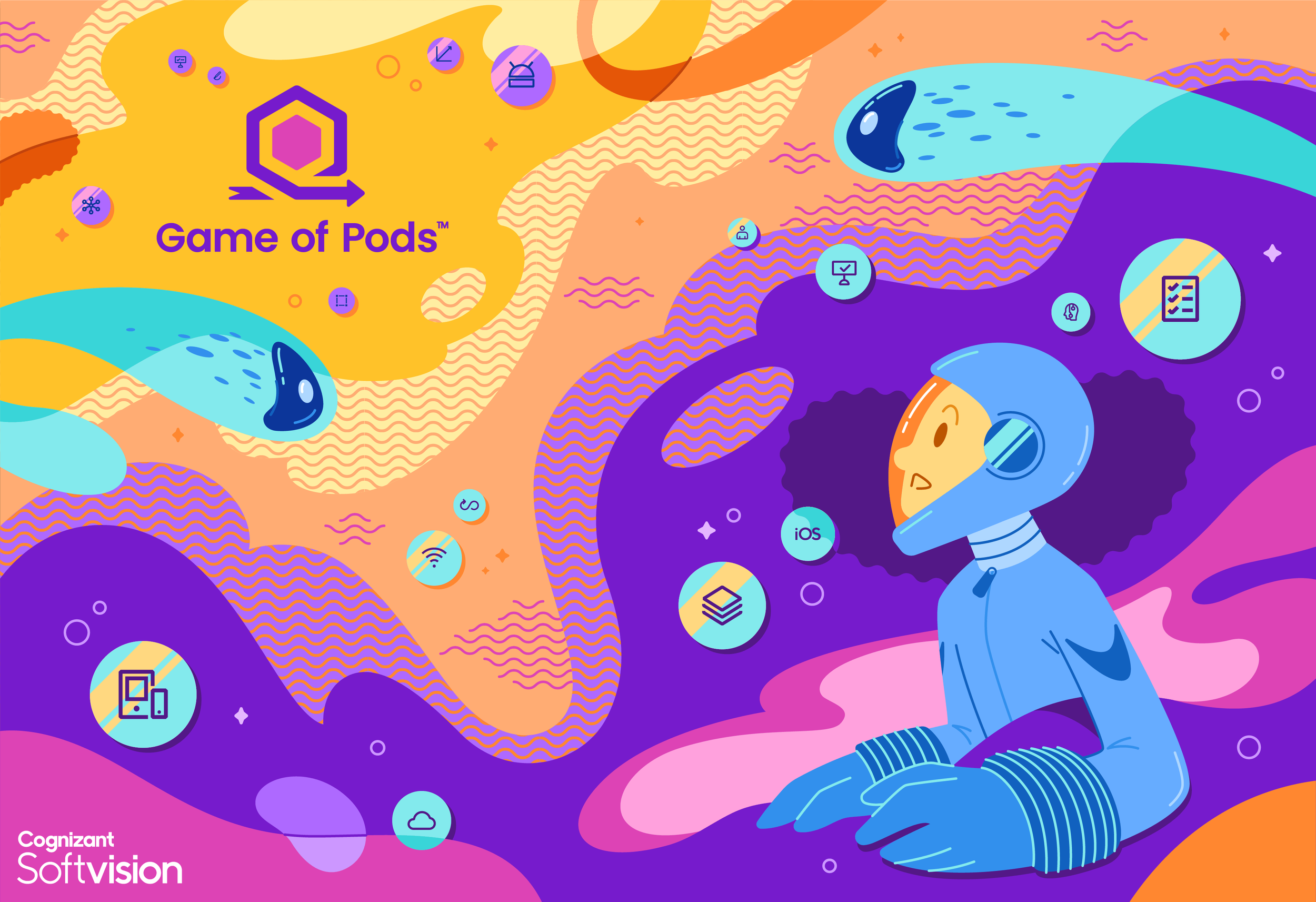
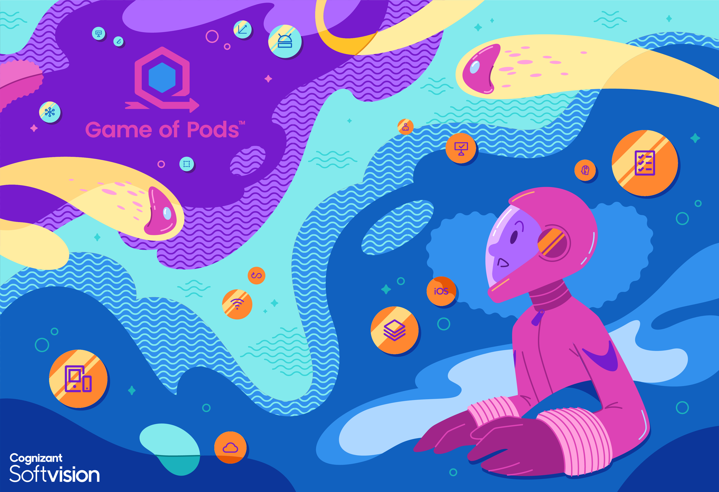
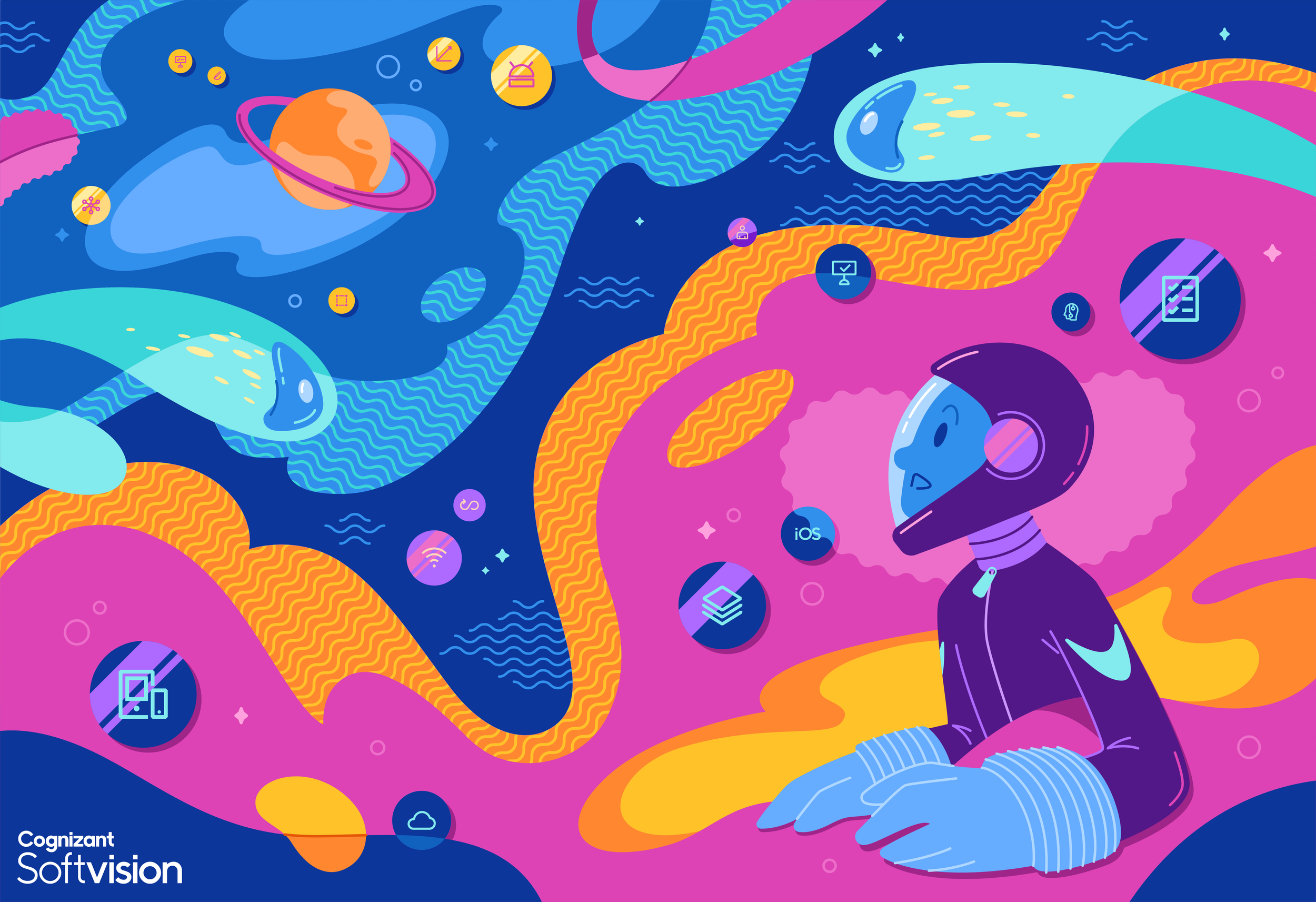
Game of Pods in real life: Murals
Prior to COVID, there was a desire in the US and Romania to bring the branding to our physical spaces for a seamless transition from web to studio. I was asked to put together concepts for larger mural pieces and eventually create the final artwork for the printed wall decal. Below are the initial concepts, color studies and final mural.

Style Guide
Once the bulk of the assets had been created and were ready to be circulated amongst the product and marketing teams, it was imperative to create a style guide for usage. This style guide defines use-cases for both “Human” and “Bean” character types, color rules, logo usage, fonts, etc. as well as a “creation” section for future additions to the asset library.
